
Tuesday 31 January 2012
Rewritten briefs
Brief #7 on here is for occasion cards. This will not be a major brief but a very small personal brief to get something produced fast and one which I can use and get out into the real world.
D&AD
Potential brief... Maybe create something a little unexpected than an advertising campaign. More personal approach with hand-rendered typography reaching out to a younger audience. In a video clip, Aviva suggest that it is more a campaign rather than a 'sales' tasks, meaning that they want people just to save for their future, not neccessarily with Aviva.


Interabang
"Cardboard Citizens is the UK’s only homeless people’s professional theatre company. The review’s format and loose binding suggests the language of newspapers and important issues. A small format, tipped-in donation form points towards a little help going a long way."


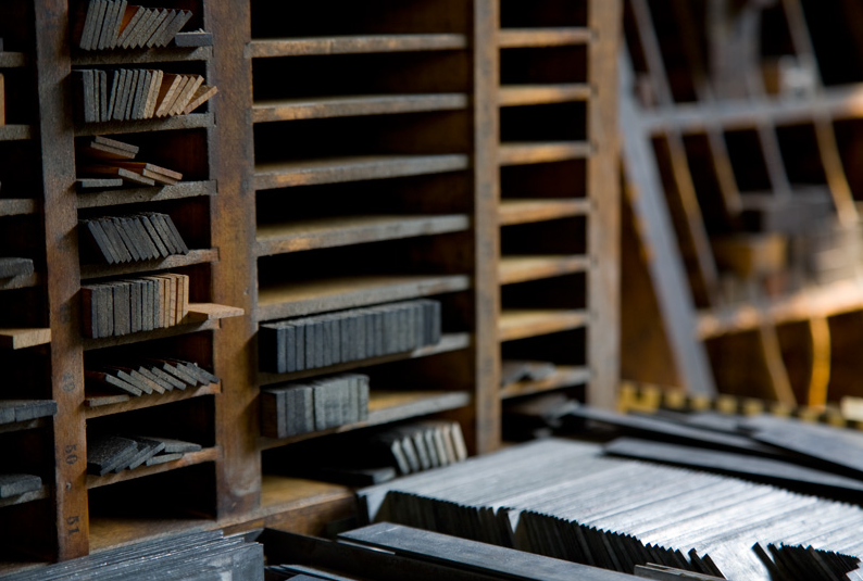
Print techniques - Digital Arts
GIVE WEIGHT TO PAPER
George Adams, senior designer, NB Studio
We recently worked with the University of Oxford to update their fundraising campaign report (right). It was to be sent to over 170,000 alumni worldwide, so it needed to be printed on a lightweight stock to keep postage costs down. We settled on a bible-type paper stock.

THE IMPORTANCE OF BLIND TESTING
Michael Smith, Cog Design
The quality and weight of the paper you print on can make or break your piece of communication. As an experiment, take three very different, blank sheets of A5 paper and put them in an envelope. Blindfold a client or colleague and ask them to open the envelope and explain what each ‘leaflet’ might be advertising. You’ll be amazed at how much people will read into feedback from their sense of touch.
GET TO KNOW THE PRINTING PROCESS
Michael C Place, creative director, Build
A little knowledge of printing can go a long way to making a good project a great one and can help you stretch a small budget. Learn the process, meet the printers, go on site. Think about using overprinting; two colours can make three colours, three make seven. Be clever and the results can amaze.


USE MATERIALS TO TRIGGER EMOTIONAL REACTIONS
Jamie Ellul, director, Magpie Studio
Choosing the right materials is as integral to the execution of an idea as the choice of typeface, words [and] imagery. Paper and print can be used in a way that adds to the recipient’s emotional reaction. If you want it to look and feel not-for-profit, use a recycled board and print in one colour. If you want a brochure to signify that a company is the best in the business and their price tag is justified, then throw the kitchen sink at it.
George Adams, senior designer, NB Studio
We recently worked with the University of Oxford to update their fundraising campaign report (right). It was to be sent to over 170,000 alumni worldwide, so it needed to be printed on a lightweight stock to keep postage costs down. We settled on a bible-type paper stock.
THE IMPORTANCE OF BLIND TESTING
Michael Smith, Cog Design
The quality and weight of the paper you print on can make or break your piece of communication. As an experiment, take three very different, blank sheets of A5 paper and put them in an envelope. Blindfold a client or colleague and ask them to open the envelope and explain what each ‘leaflet’ might be advertising. You’ll be amazed at how much people will read into feedback from their sense of touch.
GET TO KNOW THE PRINTING PROCESS
Michael C Place, creative director, Build
A little knowledge of printing can go a long way to making a good project a great one and can help you stretch a small budget. Learn the process, meet the printers, go on site. Think about using overprinting; two colours can make three colours, three make seven. Be clever and the results can amaze.
USE MATERIALS TO TRIGGER EMOTIONAL REACTIONS
Jamie Ellul, director, Magpie Studio
Choosing the right materials is as integral to the execution of an idea as the choice of typeface, words [and] imagery. Paper and print can be used in a way that adds to the recipient’s emotional reaction. If you want it to look and feel not-for-profit, use a recycled board and print in one colour. If you want a brochure to signify that a company is the best in the business and their price tag is justified, then throw the kitchen sink at it.
SOMETIMES IT’S GOOD TO BE FRUGAL
Adam Giles, creative director, Interabang
Lavish brochures are increasingly a thing of the past, and you can turn today’s constraints into a virtue. When faced with a limited production budget for a recent annual review, we kept the document loose-bound. This reduced costs, and by borrowing the feel of a newspaper it put across the idea that the review addressed current issues of importance.
Monday 30 January 2012
Penguin Design Award 2012
Brilliant quick brief to get my teeth into for the week ahead. I need a few quick turn around briefs to get on with while collecting content for my major briefs. This one really appeals to me as the deliverables are print, could easily be expanded and theres a chance of winning and doing a placement. All good things!


Saturday 28 January 2012


Ben Kelly
Another inspiration and creative Steve likes. We all like the dots used in the background of his website and think the orange could be a strong contender for a colour.


Thursday 26 January 2012

Selected briefs
Brief #1: Interior Design yearbook
Brief #2: Practical investigation into aura
Brief #3: Craft magazine
Brief #4: Film identity and promotion
Brief #5: Competition brief
Brief #6: Design Context publication
Brief #2: Practical investigation into aura
Brief #3: Craft magazine
Brief #4: Film identity and promotion
Brief #5: Competition brief
Brief #6: Design Context publication
Melbourne Dance Company
Found this little gem on Roz's blog. Beautiful imagery with beautiful type. One criticism is that the text is not easily readable. Each individual letter is legible and stunning, but all together, it is difficult to distinguish and follow the letters to understand the shape formed and so harder to understand the message. However, a great example of display font with photography!
Thoughts:
Get a great image and play around with type in-between the letterforms to merge the two elements. Also great photography of identity in context, need to work on this in my own work.


Thoughts:
Get a great image and play around with type in-between the letterforms to merge the two elements. Also great photography of identity in context, need to work on this in my own work.


Brand, identity, logo
I want to design identities... This will be what we do for the yearbook. It will be an identity for this graduating year on Interior Design.


DC research strands
- design disciplines I an interested in investigating - font development, publications, print processes
- professional practices who are producing the type of work I want to do - maybe focus in the Manchester area or at least the UK.
- functions and purposes of my designs - communicating different theories which enhance and guide my design decisions.
- understanding and awareness of production and delivery - times scale, how the audience get my product, costings and budgets.
Evolution Press
Based in Seattle, stunning perfection when it comes to letterpress! All info taken from their website.
Impression + fiber = dramatic results. Embossing offers several ways to perfectly impress your particular image. Maybe your work requires a single-level emboss, or maybe it takes a sculptural emboss to really make your image look its best. If your image is the same color as your paper, we can do a blind emboss on a blank sheet. Register emboss involves printing your image and then embossing it on the next pass.
There’s nothing like traditional letterpress to give your work a tactile, hand-crafted edge. Going to press is like – well, imagine the sharp smell of ink. The sound of the press striking paper. This is the print ink experience your art has been waiting for. By combining impression with vivid color, even a simple design yields stunning results.
Thoughts:
Find somewhere in the UK to letterpress like this! Maybe business cards. Yummy!


Meeting with Steve #1
Me and the Brady Bunch had a pre-meeting meeting to discuss what we needed to know from Steve. We found out alot of information and instead of a traditional 'yearbook' it has more information than I have seen others. It needs to act as a promotional piece for the course and reflect sustainability. From this meeting, we can now write up a more detailed brief and have arranged another meeting for after reading week to show him some initial ideas. He will be emailing us content shortly including student names, visiting professionals, course ethos etc.
Thoughts:
Research the concept including designers, architecture and sustainability in the areas Steve was interested in. Also find out more about Ben Kellys orange and determine whether this would be a suitable colour.


Thoughts:
Research the concept including designers, architecture and sustainability in the areas Steve was interested in. Also find out more about Ben Kellys orange and determine whether this would be a suitable colour.


Subscribe to:
Posts (Atom)